Dear Pennies & Pens,
The other day, I talked about how to publish a book with Kindle Direct Publishing. Today, I’d like to talk about how to create a flyer to promote your product. I am talking about this today because after you publish your book or create another product, you need to promote it.
Creating a flyer for social media posts or a printed flyer is a great way to do that because it gives a potential customer more information about your product in a concise and simple way. So below, I have outlined the steps to creating a flyer.
Step 1: Buy or download a design app or editing software. I recommend Canva (free app with paid upgrades), Adobe Indesign (paid software) or MS Powerpoint (paid software). Each of these apps and programs can be used to design flyers to promote your product.
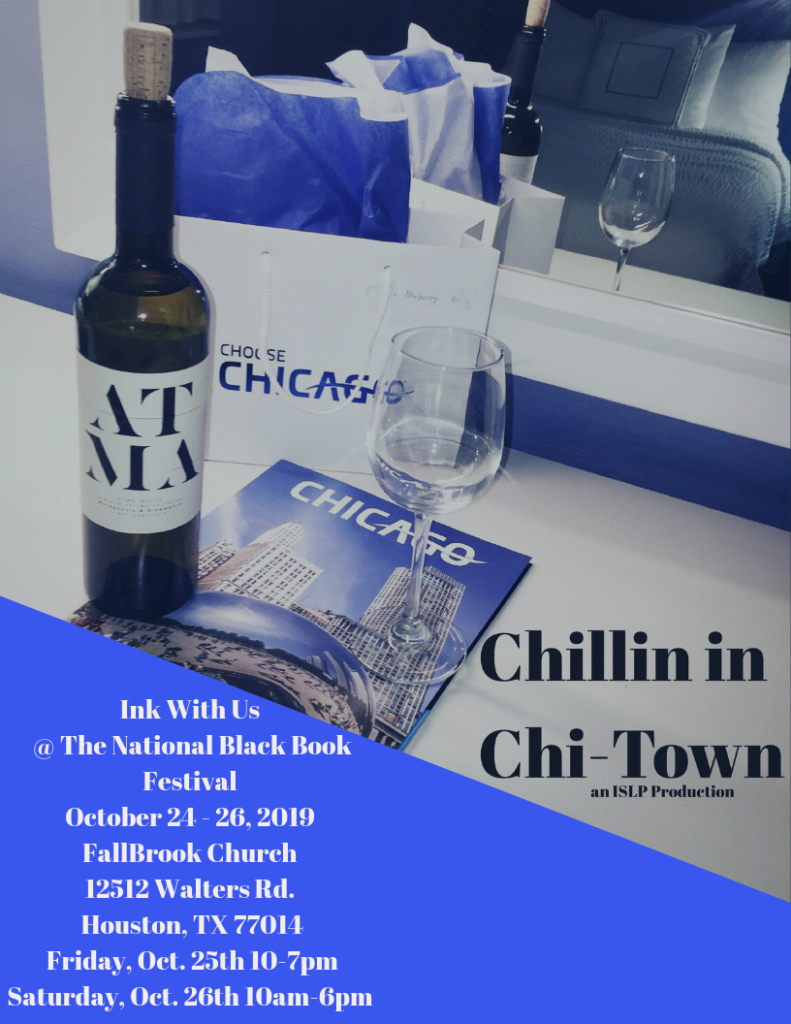
Step 2: Find images to use on the flyer. I recommend using a photo of your product or the image used on the cover of your product. Example: ISLP’s Chillin in Chi-Town flyer has the cover of the travel guide on it. If you can’t use your own images, research stock images online, hire a photographer, or shoot the images yourself. As long as you use a great image it doesn’t matter how you obtained it.

Step 3: Write the copy you will include on the flyer. I recommend using iPhone notes, MS Word, Google docs or any other platform that allows you to write text. It helps to have the text pre-written so that when you start designing the flyer, you can just copy n paste.
Step 4: Design the flyer. It depends on the program you use to design the flyer how this process will work. But what I can say is just make sure the text is readable and the image is high-res and you’ll be good. Basically, it has to not only sell your product but the person viewing the flyer needs to get information about what you’re promoting.
If you look at ISLP’s Chillin in Chi-Town flyer, it has info about the product, where the reader can find it and when. So don’t forget details like date, time and location if you’re promoting an appearance at an upcoming event like I did.

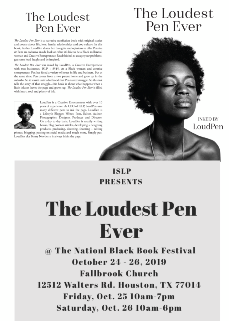
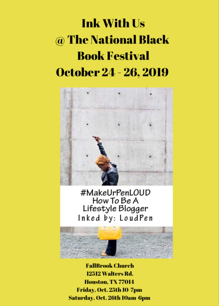
Step 5: A few more tips. Use a font on the flyer that is “on brand” meaning use the same or a similar font to the one used on your product or logo. This way, you keep your branding consistent. Also, use your brand or product colors. If you look at the #MakeUrPenLoud flyer, I used a yellow background because it matches the yellow bag you see me holding on the cover. The Loudest Pen Ever flyer is black and white because the cover image is as well.
One more note, Penny loves you little baby, but if you send that email I’m going to charge a consultation fee for helping you. I don’t answer questions and give advice I’ve spent years learning for free. I write posts like this out of the goodness of my heart to help others. Please don’t take advantage of me and I promise to do the same for you.

So that’s all the inktips for today, little baby! I hope this helps you with creating a flyer for your product. Please note, if you have specific questions, you can email me loudpen8515@gmail.com.
And there it is. de la Pen…All Pen Everything. With us, keeping it real never goes wrong.
Hey Penny,
Thanks so much for recommending Canva for making flyers. We’re big fans of your blog and can’t wait to hear more from you!
Love,
The Canva Team
Thanks, Kate! I am so happy to hear that the Canva team enjoyed this post!